


Health Systems
Take control of your healthcare
CHALLENGE
Understanding Health Systems workflow and the underlying architectural complexities of the EMR. Workflow integration: physicians and schedulers use existing systems as much as possible, and the need for Health Systems to embed seamlessly to drive Telehealth-specific functions.
To comply with the NDA, I have omitted and obfuscated confidential information in this project.
GOAL
Explore, research, and prototype features and tools to increase patient engagement with their hospitals, their medical team, and their own health, with a particular focus on patients with ongoing treatment.
The following is a module from the larger scope of delivering a comprehensive Telehealth/virtual care solution that enables clients to consolidate existing
Telehealth projects and extend into new areas.
MY ROLE
User Research, Stakeholder Interview, Contextual Enquiry;
Information Architecture, Content Strategy, Competitive Analysis, Wireframing, Prototyping. Evangelize UX and collaborate with Stakeholders, Designers, Developers, Product managers, and UX managers.
TEAM
I collaborated with one other UX designer Shawn Wong on this project The team also included a UX manager, a product manager and multiple stakeholders.
USER RESEARCH
Contextual Enquiry, Interviews. We initially created an abstract grouping based on the project scope to discover the main areas of focus from patient’s perspective

IDEATION AND BRAINSTORMING
A technique we used to brainstorm content ideas was inspired by works of UX expert Catriona Shedd.
It involves a five-step approach to generate ideas and solve problems.
1. Define Goals & State the Problem
2. Stimulate Creativity
3. Ideate Individually
4. Share, Expand, and Critique
5. Categorize and Synthesize
We looked through airline apps like Delta, Virgin, and American Airlines which provided great customer
check-in feature and tried to synthesize the check-in flow of a passenger boarding a flight and transposed that as
checking into your healthcare consultation. For features like timeline view, we drew inspiration from apps like Path and Tripit.
After hours of discussion and multiple iterations, we categorized our assumptions and ideas into sets of feature groups.


PERSONAS
Personas help to focus product decisions by adding a layer of real-world consideration to the conversation. They act almost like another person in the room when making vital product decisions. The primary users of the app were medical patients seeking to manage their healthcare needs from a single point of contact. These Personas were provided by Point Clear.
PRIMARY USER: Maria Guerrero, an elementary teacher who spends all her attention & care towards her students in class that she does not have any time to go to the doctor even if it only took her an hour.
USER NEED #1
Ms. Guerrero needs a means to quickly research and schedule an appointment with a doctor.
USER NEED #2
Ms. Guerrero needs to be reminded of her doctor's appointment.

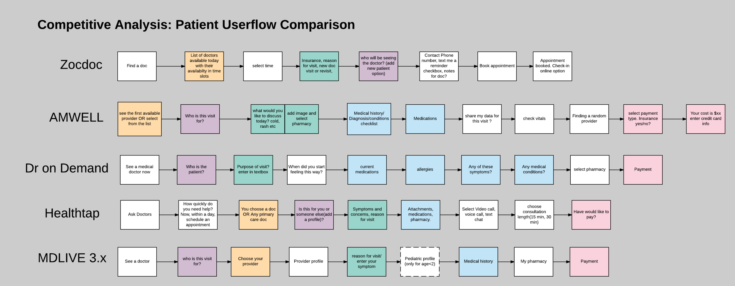
COMPETITIVE ANALYSIS
I compared the existing version 'See a doctor online' user flow with top Telehealth apps in the market. Flow states were colored coded to find commonalities and patterns which helped us to gain a deeper understanding of competitors process flow.
Scheduling workflow was a priority so we included the interaction into our architecture. We also wanted to see how our competitors setup their scheduling workflows so we did a competitive analysis on Zocdoc, Amwell, Dr On Demand, Healthtap, and MDLive 3.0 (Our own legacy version of MDLive).
WORKFLOWS
With everything that was gathered, my teammate and I further refined our information architecture and categorized desired features in a structure that was logical and discoverable for our user. Below is an image of the architecture.

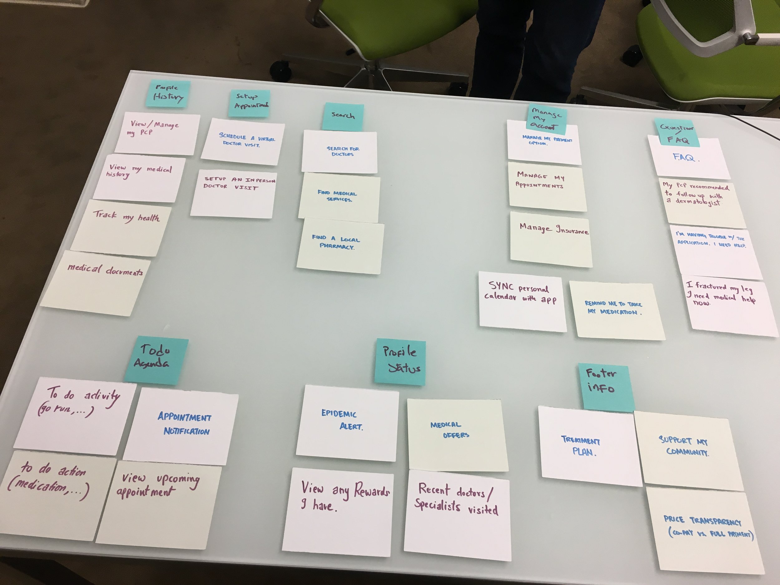
INFORMATION ARCHITECTURE BY CARD SORT
Card sorting is a well-established research technique for discovering how people understand and categorize information.
It helps to sort results to group and label your website information in a way that makes the most sense to your audience.
We used Optimal Workshop to conduct the online card sort along with a physical in-house card sort
exercise with 15 participants and 30 cards.
ANALYZING CARD SORT RESULTS
We combined the data from results of both online and physical card sorting. We analyzed qualitative information based on user comments we noted during the physical sorting session. Quantitative data was put together in meaningful forms by Optimal Workshop.

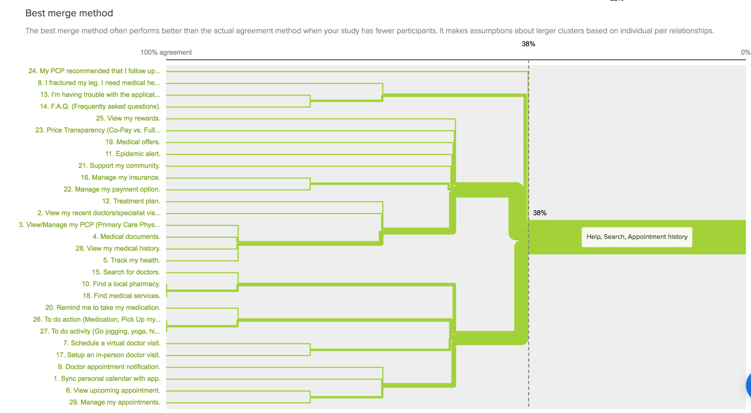
SIMILARITY MATRIX AND BEST MERGE METHOD
The similarity matrix shows the percentage of participants who agree with each card pairing. You can view the number of times a pair of cards were grouped together by hovering your mouse over the pair's score cell in the matrix. The algorithm attempts to cluster similar cards along the right edge of the matrix.
Example: Card 28. View my medical history and card 5. Track my health were grouped together by 87% of the total participants. The greater the percentage, the higher probability of users looking for these items at the same location.
The best merge method often performs better than the actual agreement method when the study has fewer participants. It makes assumptions about larger clusters based on individual pair relationships.
SITEMAP

HIERARCHICAL SITE STRUCTURE
Based on the analysis we concluded that a combination of hierarchical architecture
pattern along with Hub and Spoke model would be an ideal solution.
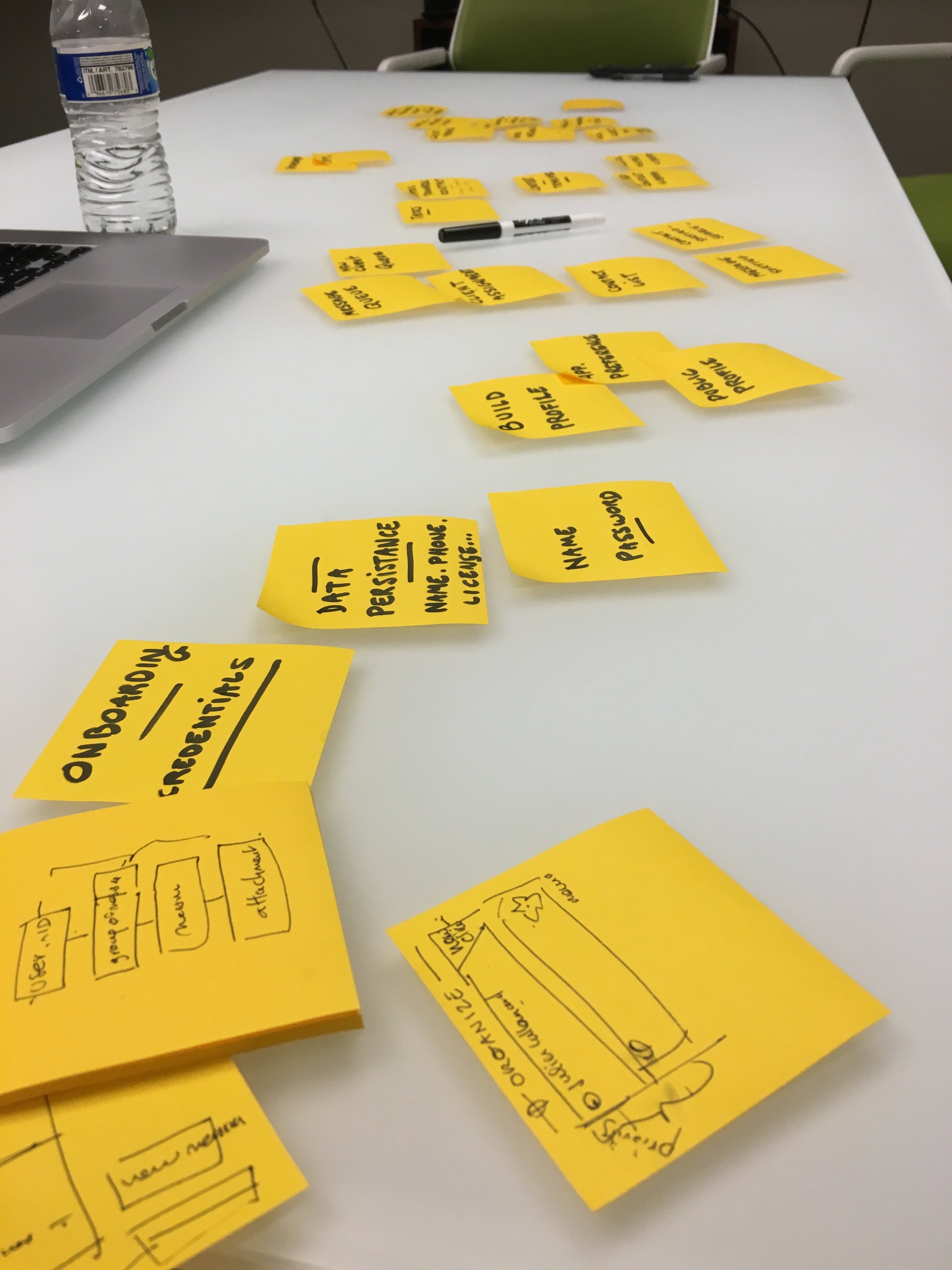
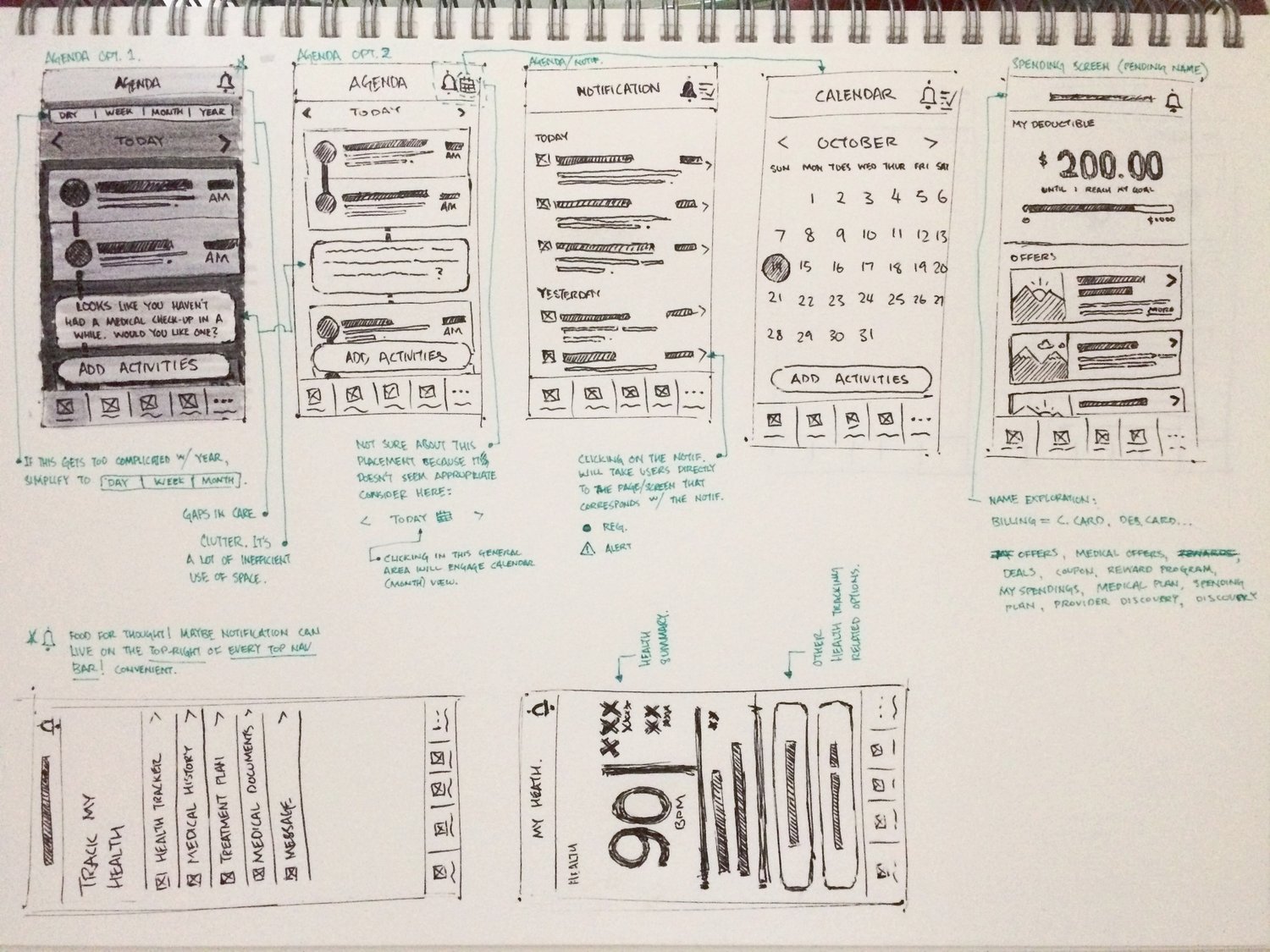
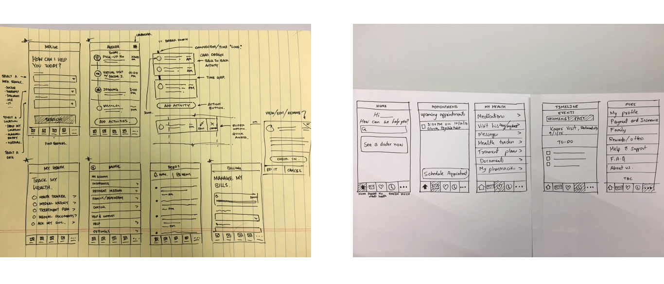
PAPER PROTOTYPES
With these findings, we were able to quickly draft a few initial concepts that described the product. Below is one of our drafted solution that was proposed to the team and stakeholders for project alignment and feedback. Communication is key!
WIREFRAMES
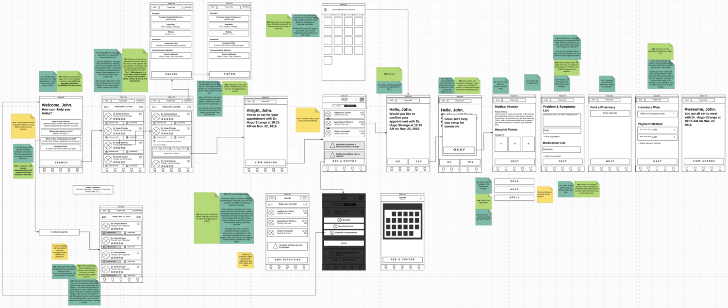
Below is a set of wireframes placed in a workflow format. We did not have enough budget for user-testing so we spoke to a few subject matter experts to obtain their feedbacks on our proposals. The post-it notes below are feedbacks & suggestions accumulated from our experts. My partner and I then analyzed each feedback and applied them accordingly to our initial drafts.
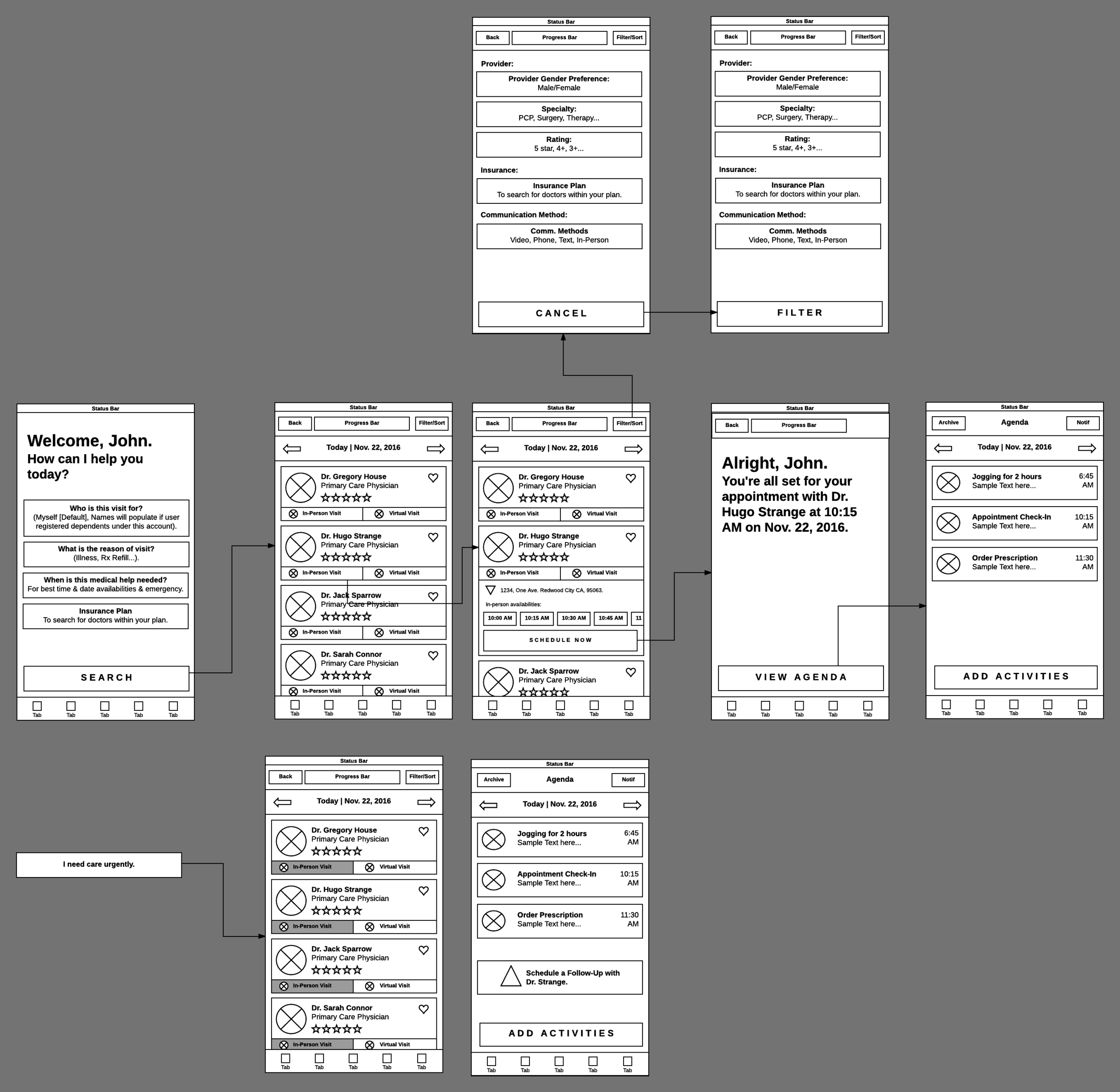
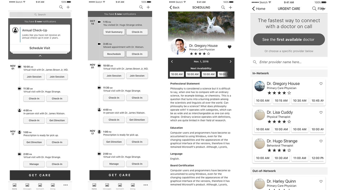
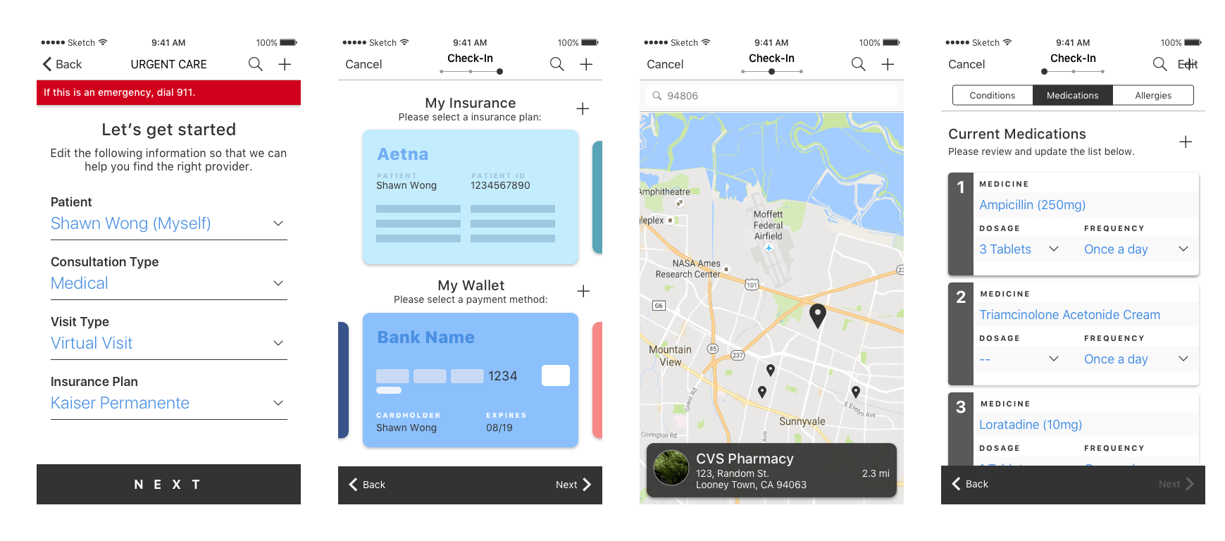
PROTOTYPE
After several rounds of iteration, we finally landed on this series of Hi-Fi wireframes. The reason for this level of fidelity is due to marketing reasons. Our stakeholders agreed with our design proposals and was ready to share with clients to recruit prospective investors. A fully developed Invision prototype was built for this purpose but this was where the project had halted due to other company priorities that required our attention. This project had not resume since so it remained a concept. However, many of the discoveries made in this incubator project helped improve features & workflows that were implemented in MDLive's existing mobile application.
REFLECTION
Designing for Healthcare requires a lot of consideration and patience. Make sure you have every minute/detail of your research studies planned out. If you happen to make a mistake, rerunning the study could be expensive, time-consuming or even impossible at times. When presenting results to a stakeholder, make sure you avoid diving deep into details and provide them with a high-level overview only.
Despite the bumps along this journey, I relied on research and logic to structure my tasks for each design phase. I then determined my next steps based on the outcomes of prior discovery. I was able to navigate myself and my partner through a murky path and in that sense, I felt accomplished. I was proud of one additional accomplishment. The concepts that my partner and I developed helped inspire many features that were incorporated in MDLive's current mobile app. Overall, this project was productive and therefore a success.